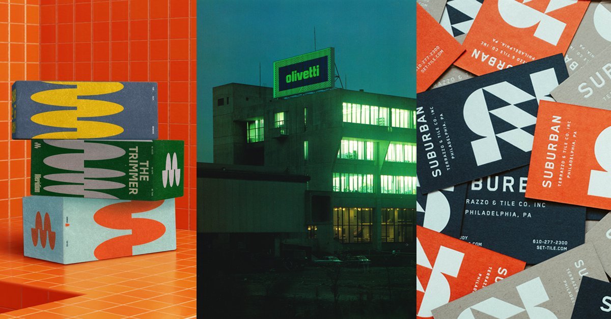
At its core, a trend is evidence of a successful idea. Rebrands that resemble one another aren’t necessarily using similar visual treatments because they’re trendy; rather, their trendiness is proof of their effectiveness. Many of the redundant tropes seen in contemporary rebrands may primarily emerge out of functional constraints – certain formal qualities are simply better suited for the needs of present-day brands, especially fast-moving digital ones. As Dave Ladd, executive creative director at global design agency Koto (the studio behind rebrands for major players from Discord to WhatsApp), notes that blue is the easiest colour to make ADA (Americans with Disabilities Act) compliant, which is likely what causes it to show up in so many visual identities in tech. The same could be said of the flat-vector illustration style that’s bubbled up over the last 10 years, or its arguable successor, the loose brushy doodles seen in rebrands from Koto’s Glassdoor to Collins’ Mailchimp (a current topic of debate online). Both styles are, in some respect, minimum viable illustration; as Dave describes it, they’re evergreen, convey diversity in the safest, most risk-free way possible, and are simplistic enough to be created by a range of illustrators and designers. In a sense, the real value of these distinct illustration styles isn’t necessarily their formal qualities (though there are many talented illustrators working in such styles who bring unique perspectives to the work), but, instead, in their efficacy as fodder for brand building. It’s no surprise, then, that multiple design studios may find themselves drawn to the same tools and formal approaches in the pursuit of a modern, production-friendly rebrand. In these cases, the pursuit of originality takes a backseat to that of utility.
Even the pursuit of original ideas doesn’t guarantee originality, however. At times, visual trends can operate outside the laws of physics and resemble something closer to spontaneous generation. The simultaneous invention of Calculus by both Newton and Leibniz serves as a testament to the fact that ideas, at times, seem to hover in the collective consciousness, simply waiting for the right moment and mind to give them form. As keen observers, designers are uniquely positioned to put a finger to today’s aesthetic breeze and transform the ideas floating in the zeitgeist into tangible outputs. After all, designers are a bit like scrapbookers: we methodically select and combine elements from existing sources to craft novel interpretations. Rarely do we make things completely from scratch. Instead, we curate select elements from the world around us to create something we feel is novel. But what is novelty? Our collective definition of newness is ever-changing, and exists only in relation to what we see frequently. What we consider original tends to be the opposite of whatever we consider ordinary. Critics often refer to the “20-year trend cycle”, which implies there may even be an empirical consensus around when things begin to look new again – Gen-Z loves Y2K fashion precisely because they didn’t have to live through its first iteration. As the often-referenced pendulum swing dictates, when sans-serifs hit oversaturation, we individually, but collectively, feel the itch to use a slab.


No Comment! Be the first one.